Intro
Our brand is OTrack’s “language” and it helps us all maintain a cohesive and collective message in the way we communicate and the way in which our brand is used by others.
Logos
Full logo
To be used when being used alone with no accompanying text. Used to identify the company as a whole.
Example usage: Corporate stationery, presentation cover page etc
Note: This logo should appear on a white background only.

[Right click here to download PNG version of full logo]
[Right click here to download PDF version of full logo]
![[Right click here to download PNG version of full logo]](/wp-content/uploads/2018/01/OTrack2018-Full-rgb.png)
Standard logo
Used in most situations where branding is required. EG: Social media, website, advertising where the logo should be legible at small sizes and where a strap-line is not required (or may conflict with the message)
Note: This logo should appear on a white background only.

[Right click here to download PNG version of standard logo]
[Right click here to download PDF version of standard logo]
![[Right click here to download PNG version of standard logo]](/wp-content/uploads/2018/01/OTrack2018-Standard-rgb.png)
Logo use
Ensure adequate space around logo. Using the width of the ‘O’ as a single unit we have at least 1 unit around the logo and 1.5 units to the right to avoid text clash.
Smallest print size : 60mm wide
Smallest Screen size: 230px wide
Smallest print size : 40mm wide
Smallest Screen size: 150px wide
Logo variations
Used where design / output media restricts use of colour logo variants.
Note: The full colour logo should always be used where possible.
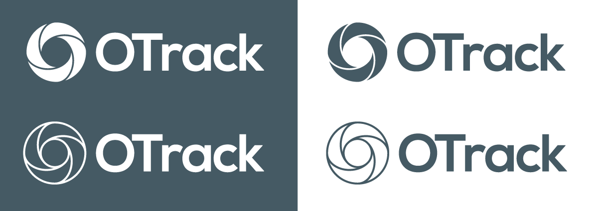
Standard monotone colour palette.

Examples on extended brand palette.
OTrack colors
These are the 4 core colours for the brand – included are tones and highlight colours. Wherever practical use the core colour.
Click here to download swatches for Adobe programs
Core colors
| 100 | CORE | 500 | |
| Teal | #b2ebf2 | #26c6da | #0097a7 |
| Green | #dcedc8 | #9ccc65 | #7cb342 |
| Red | #ffcdd2 | #e57373 | #ef5350 |
| Orange | #ffe0b2 | #ffb74d | #ff9800 |
Extended color palette
